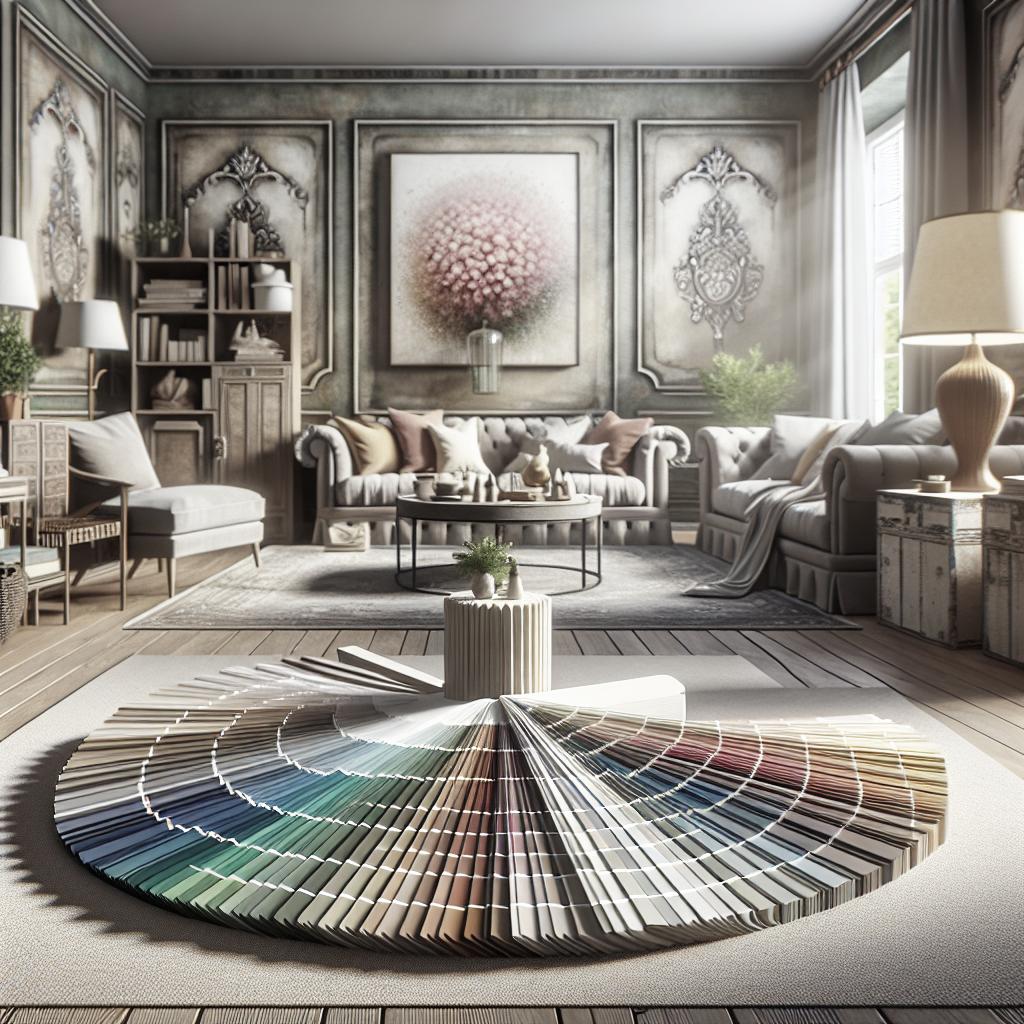
### Crafting a Harmonious Color Scheme for Your Home Creating a cohesive color scheme is an art form that requires blending aesthetics with functionality to transform your home into a seamless, welcoming environment. This blog post will guide you through the essential steps of developing a unified color palette, beginning with finding inspiration and understanding how individual room choices impact the overall flow of your space. You’ll delve into the principles of color theory, exploring the impact of hues, shades, and undertones. Lastly, we’ll reveal the one color that design experts unanimously recommend for bringing harmony to any color scheme. Whether you’re a DIY enthusiast or seeking professional guidance, these insights will empower you to make informed decisions that reflect your personal style while maintaining a cohesive feel throughout your home. ## Inspiration The first step in establishing a cohesive color scheme is drawing inspiration from the world around you. Nature can serve as a prolific source of ideas, offering a spectrum of colors that are both complementary and balanced. From the tranquil blues and greens of a forest landscape to the serene pastels of a sunrise, nature’s palette provides combinations that effortlessly work together. Visiting art galleries or exploring interior design books and magazines can also offer fresh perspectives and ideas on how colors interact within a space. Consider creating a mood board using tools like Pinterest or physical samples such as fabric swatches and paint chips. Organizing your thoughts visually helps clarify your tastes and preferences, making it easier to spot trends or repeated patterns. This visual representation serves as a reference point that can guide your decisions as you move through each room, ensuring that personal touches are authentically integrated with the overall theme. Lastly, focus on textures and finishes as part of your inspiration process. Often, the same color may look completely different when paired with various materials like wood, metal, or fabric. Understanding how texture influences color perception can aid in achieving a cohesive look while adding depth and interest to the space. ## Consider the Individual Room as Well as the Flow Each room in your home serves a distinct purpose and, as such, requires unique color considerations based on its use and emotional significance. For example, bedrooms benefit from calming hues that promote relaxation, whereas vibrant, energetic colors suit living areas designed for social interaction. Kitchens, often the hub of a home, can be brightened with whites and light colors to facilitate a fresh, clean atmosphere. However, it’s equally important to consider how each room fits within the larger context of your home’s entirety. A cohesive color scheme should enable seamless transitions as you move from one space to another, creating a pleasant visual journey. This can be achieved by establishing a common thread, such as a consistent neutral base or accent color, which unifies the design without feeling monotonous. Don’t overlook architectural details like trim, moldings, and doorways that often span multiple rooms. Using a consistent color for these elements can tie together disparate spaces, enhancing the sense of flow throughout your home. This can be particularly effective in open-concept designs where natural demarcations are absent, requiring thoughtful color continuity to maintain visual harmony. ## The Principles of a Cohesive Colour Scheme To craft a well-balanced color scheme, it’s vital to have a grasp of basic color theory principles. The color wheel, a fundamental tool in design, helps identify relationships between colors, such as complementary, analogous, and triadic schemes. Complementary colors—those opposite each other on the wheel—offer high contrast and vibrancy, while analogous colors sit side-by-side and create a harmonious, calm palette. Undertones play a pivotal role in achieving a cohesive look. Even when two colors might be ideal matches in theory, their underlying tones—warm or cool—can disrupt harmony if mismatched. Testing paint samples in the intended space, under various lighting conditions, can help ensure that chosen colors work together cohesively. Additionally, balance and proportion are crucial in a cohesive scheme. Adopting the 60-30-10 rule, a guideline where the dominant color covers 60% of the space, the secondary color 30%, and the accent color 10%, can help maintain visual stability while allowing flexibility for creativity. Applying this principle across different spaces ensures a rhythmic flow that resonates throughout your home. ## And If There’s One Colour Everyone Recommends…. When seeking a universally appealing color to anchor your palette, designers and homeowners alike often recommend shades of blue. Known for its versatility, blue pairs well with various colors—whether it’s acting as a bold statement in deep navy or providing a tranquil backdrop in soft pastel hues. Blue’s adaptability extends across styles and settings, making it a consistent favorite. Beyond its aesthetic versatility, blue is associated with psychological benefits such as promoting calmness and enhancing productivity, making it suitable for various applications from bedrooms to home offices. Its ability to induce tranquility while still providing a sophisticated edge is why blue frequently earns a spot in cohesive color schemes around the world. To incorporate blue effectively, consider its tone and temperature, and how it interacts with other elements in your space. Whether you choose to use blue as a dominant hue or a subtle accent, its timeless appeal can balance other colors and bring a sense of unity and serenity to your home decor. ### Future Prospects Below is a summary of the article’s main points in a tabular format:
| Step | Key Considerations |
|---|---|
| Inspiration | Draw from nature, art, and textures; create a mood board to visualize your ideas. |
| Consider Individual Rooms and Flow | Choose colors based on room purpose; maintain flow with consistent elements across rooms. |
| Cohesive Color Principles | Understand color theory, match undertones, and apply the 60-30-10 rule for balance. |
| The Recommended Color: Blue | Use blue for its versatility and psychological benefits; adapt it to suit various spaces. |
As you embark on your journey to create a cohesive color scheme, remember that your choices should ultimately reflect your personality and comfort. Embrace the artistic freedom of design to make your space truly engaging and harmonious.