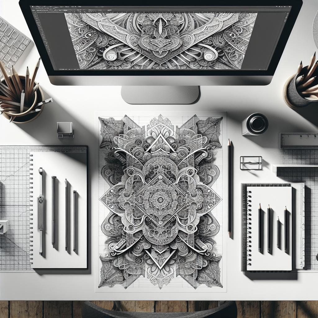
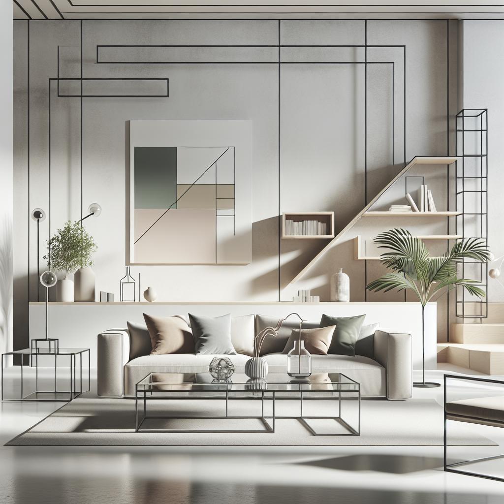
### Introduction Design is much more than an aesthetic endeavor; it’s a fusion of creativity and engineered precision, orchestrating elements to form a coherent and compelling visual narrative. One of the most fundamental concepts in design is balance, manifested through the careful arrangement of elements to create harmony and stability. In this blog post, we’ll explore the importance and techniques of achieving balance through symmetry in design. We’ll discuss the nuances between physical and visual balance, why visual balance matters, the four types of balance, and delve deeper into symmetry versus asymmetry. We’ll also look at the Gestalt Principles, which are vital for perceiving complex designs holistically. To illustrate, we will provide examples of different types of balance seen in design, culminating in a summary with resources for further exploration and reading. Whether you’re a seasoned designer or just starting out, understanding symmetry and balance can enhance your ability to create impactful designs. — ## Physical And Visual Balance In the realm of design, balance can be dissected into two main categories: physical and visual. Physical balance relates to the tangible and literal stability of objects—you can see this in architecture or product design, where the weight and distribution of materials are carefully calculated to ensure the object remains upright and sturdy. On the other hand, visual balance is more abstract. It deals with how elements are arranged within a composition, affecting how the observer’s eye navigates the design. Visual balance is akin to a delicate dance between various components, such as color, shape, and space. When these components are well-balanced, the design feels harmonious and pleasing to the eye. If certain elements dominate too heavily, it can make the observer feel uneasy or overwhelmed. Knowing how to adjust these visual weights enables designers to communicate their message more effectively while engaging their audience. Achieving visual balance often involves manipulating elements to create either symmetry or asymmetry, using principles that guide the placement and proportion of elements to evoke a sense of equilibrium. Mastery of these techniques allows designers to craft layouts that are not only aesthetically appealing but also functionally efficient, leading to increased user engagement and satisfaction. — ## Why Visual Balance Is Important Visual balance is crucial in design because it directly affects the viewer’s perception and interpretation of a composition. A well-balanced design guides the viewer’s attention and helps them navigate through the various elements smoothly. It provides clarity and can prevent a sense of chaos or confusion, which is especially important in contexts like user interface design, where usability is paramount. Beyond aesthetics, visual balance also plays a vital role in reinforcing the design’s function and message. For example, in web design, a balanced layout can improve readability, enhance user experience, and maintain focus on call-to-action elements. In print media, such as magazines or posters, balance ensures that important headlines and images are emphasized without overshadowing other essential information. Ultimately, understanding and employing visual balance is a pathway to creating designs that resonate with audiences and achieve specific communicative goals. By applying the right type of balance—be it symmetrical or asymmetrical—designers can evoke particular emotions, denote significance, and convey messages more effectively. — ## Four Types Of Balance The world of design recognizes four primary types of balance: symmetrical, asymmetrical, radial, and mosaic. Each type contributes uniquely to the composition’s feel and serves different aesthetic and functional purposes. Symmetrical balance is achieved when elements are mirrored on either side of a central axis, creating a formal and often serene composition. It’s akin to viewing the evenly matched wings of a butterfly. This type of balance is commonly found in architecture and interior designs where stability and order are desired characteristics. Asymmetrical balance involves balancing elements of differing sizes, weights, or colors distribute visual weight evenly without exact duplication. This balance offers a more dynamic and visually interesting composition, often using contrast and rhythm to maintain equilibrium. It’s prevalent in modern designs, where creativity and innovation are prioritized. Radial balance radiates from a central point, and it is synonymous with designs like spirals or circular arrangements. It creates movement and draws the viewer’s attention to the center. It’s often employed in contexts such as logos or mandalas, where a focal point is crucial. Mosaic balance is an informal version of balance where elements are distributed in a seemingly random but harmonious way throughout the design. It emphasizes unity in diversity and is often seen in abstract or eclectic designs where an overall impression is valued over symmetry or order. — ## Symmetry And Asymmetry ### Symmetry Symmetry in design is the epitome of harmony and balance. It can be achieved in several ways, such as bilateral, radial, or even translational symmetry, where elements are mirrored or repeated. Symmetrical designs are not only appealing but are also perceived as comfortable and reassuring, making them a favorite in corporate identities and user interfaces. The predictability and order that symmetry provides can be utilized in crafting intuitive and user-friendly designs. The psychological aspect of symmetry should not be understated—it is often associated with beauty, reliability, and trustworthiness. This is why many prestigious brands incorporate symmetrical logos, as it funnels these subconscious associations with elegance and stability into their brand image. ### Asymmetry Asymmetrical design, while seemingly unstructured, can produce compositions that feel just as balanced and compelling as symmetrical ones. Rather than mirroring elements, asymmetry uses contrast—color contrasts, varying shapes, and sizes—to achieve balance. This type of balance tends to be more dynamic, interesting, and can lead to more engaging and visually stimulating designs. Asymmetry offers creative flexibility and is widely used in modern and contemporary design practices, such as in art galleries or avant-garde spaces. It allows designers to direct focus strategically, create visual tension, or convey complexity and movement, offering a break from the predictability of symmetrical designs. — ## Gestalt Principles The Gestalt Principles play a pivotal role in how we perceive and interpret balance in a design. These principles, rooted in psychology, explain how we organize visual elements into groups or unified wholes when certain principles are applied. One well-known principle is similarity , which states that elements are grouped together if they look similar. This principle helps in creating a sense of continuity and rhythm within a design, leading to a balanced visual experience. Proximity dictates that elements close to one another are perceived as related, which can be used to establish relationships and hierarchies within a layout. Another key principle is closure , where the mind fills in missing parts of an incomplete figure, lending itself to designs that use negative space effectively. Continuity suggests that elements arranged on a line or curve are perceived to be more related than those not on the line or curve, aiding in creating seamless and fluid designs. By leveraging these principles, designers can guide viewers’ perceptions and interactions with a design, resulting in a harmonious and balanced composition. — ## Examples ### Examples Of Symmetrical Balance Symmetrical balance is prevalent in numerous design forms, from classical architecture like the Parthenon, with its evenly spaced columns, to modern web layouts that utilize a central axis to organize content. The Apple logo is a modern emblem of symmetrical balance, giving a sense of harmony and perfection. In editorial design, magazines often use symmetrical layouts where text boxes and images are mirrored across the page to provide stability and elegance. This type of balance is also common in interface designs where users expect a consistent and logical navigation flow. ### Examples Of Asymmetrical Balance One can find asymmetrical balance prominently in art, such as in the paintings of Jackson Pollock, where dynamic compositions evoke motion and emotion. In graphic design, magazines often use asymmetrical layouts to create interest and guide the reader’s eye through the page. A website such as Airbnb utilizes asymmetry to focus user attention on particular elements, contrasting fonts, or positioning images to create a hierarchy that guides interaction naturally. Asymmetry allows for creative design strategies without sacrificing aesthetic appeal or functionality. ### Examples Of Radial Balance Radial balance is a concept extrapolated beautifully in designs like cathedral rose windows, or in mandalas used in cultural and religious contexts, where elements radiate from a center point, forming a cohesive and ornate design. In modern design, the Starbucks logo utilizes radial balance to focus the eye and convey a sense of completeness and unity, exemplifying how elements can effortlessly flow outwards from a central point to create equilibrium. ### Examples Of Mosaic Balance Mosaic balance can be seen in designs where chaos forms an underlying order, like the paintings of Gustav Klimt or the quilts of Gee’s Bend, where diverse elements come together to form a cohesive whole. Graphic designers might employ mosaic balance in posters or advertisements where text, color, and imagery intermingle without strict patterning, delivering beauty in variety and ensuring no one element overpowers another, allowing for diverse visual interest. — ## Summary As you venture further into the field of design, understanding symmetry and balance will be crucial to your ability to create fabulous, functional compositions. While symmetrical balance offers predictability and classical beauty, asymmetrical balance allows for creativity and modern aesthetics. The Gestalt Principles act as your compass, guiding you through the journey of visual perception. ### Additional Resources For a deeper dive into the concept of balance in design, explore the teachings of celebrated designers, review case studies of successful designs, or participate in design forums and workshops. ### Further Reading If you’re looking to expand your knowledge, consider academic resources on design theory and psychology of perception or delve into books that explore historical and contemporary design practices.
| Section | Key Points |
|---|---|
| Physical And Visual Balance | Difference between tangible and visual elements, importance in design. |
| Why Visual Balance Is Important | Enhances user experience, clarity in design, emotional impact. |
| Four Types Of Balance | Symmetrical, Asymmetrical, Radial, Mosaic—each offers unique benefits. |
| Symmetry And Asymmetry | Understand the contrasts between order and creative flexibility. |
| Gestalt Principles | Psychological insights into perception and design balance. |
| Examples | Real-world applications of various balance types in design. |
| Summary | Balance remains a cornerstone of effective and appealing design. |


