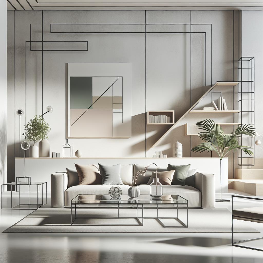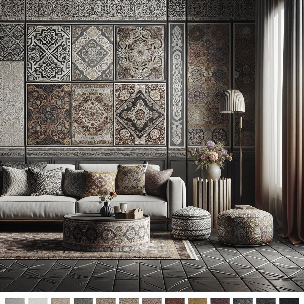
Incorporating patterns and prints into interior design is an art that transforms spaces into vibrant, captivating environments. Patterns introduce texture, color, and visual dynamics, offering endless possibilities for personal expression and style. Whether in a living room, bedroom, or hallway, mixing patterns effectively can elevate your home’s aesthetic appeal while balancing harmony and contrast. This guide will delve into key principles and techniques for effectively using patterns in your decor, dispelling myths and providing practical advice. From starting your scheme with a bold rug, taking scale into account, and allowing patterns to breathe, to selecting a showstopper fabric and mastering color palettes, we’ll explore every facet of pattern use in interior design. Additionally, we’ll discuss creating impactful pattern combinations by mixing opposites and incorporating vintage elements for added charm. Read on to discover expert tips and tricks tailored for every room, helping you to skillfully marry different patterns to reflect your unique taste. ## Mixing patterns and prints in interior design ### 1. First rule: there are no rules When it comes to mixing patterns and prints, the first rule is that there are no fixed rules. Interior design is an expression of personal style, and being too rigid can stifle creativity. Embrace your unique taste and remember that what resonates with you might not align with traditional guidelines, and that’s okay. While there are guidelines worth considering to ensure cohesion, feel free to challenge norms and push boundaries with bold combinations. The freedom of pattern mixing allows you to experiment with a range of textures and designs. Consider blending florals with geometrics or abstracts with stripes. The key is finding combinations that evoke the mood and feel you want for your space. Each pattern tells a story and, when pieced together, they create a narrative unique to your home. ### 2. Give patterns space to breathe Once you decide to mix patterns, providing ample breathing space is crucial. Overcrowding patterns within a space can lead to visual chaos, making the room feel cramped and overwhelming. Create balance by incorporating neutral areas where the eye can rest, preventing the patterns from clashing. Consider using solid colors or muted tones to break up patterns. If a space feels heavy, adding a neutral element like a plain wall or a simple piece of furniture can reset the visual weight. The patterns should complement the design rather than overpower it, providing a harmonious blend that feels both dynamic and calming. ### 3. Start your scheme with a rug A rug can serve as a foundational piece that anchors your entire interior design scheme. Starting with a patterned rug allows you to build your aesthetic from the ground up, offering a color palette and style direction for the rest of your decor. Select a rug that draws attention with an intricate design or bold colors, as it sets the tone for the other patterns you will incorporate. The rug’s pattern can act as a reference point, guiding your choices for prints in textiles, upholstery, wallpaper, and curtains. By beginning with a strong base, the rest of your pattern selection will fall into place more naturally. ### 4. Create balance with pattern Achieving balance within a space that features multiple patterns is key to maintaining visual harmony. One approach is to use patterns strategically, distributing them evenly throughout the room so no one area feels too concentrated with prints. For example, if you have a bold floral pattern on throw pillows, consider using a subtler stripe or geometric pattern for curtains. Balance also involves blending different scales of print—pair intricate, small-scale patterns with larger, simpler designs. When balanced correctly, patterns will interweave seamlessly, creating an inviting and cohesive look. ### 5. Start with the showstopper fabric Choosing a showstopper fabric to anchor your design can streamline your pattern mixing process. A standout print becomes the focal point around which to coordinate other patterns, serving as a muse for the overall design narrative. Identify a fabric with an eye-catching pattern that resonates deeply with your style. This could be a vibrant floral, a traditional toile, or a modern abstract print. Once you’ve selected this key piece, it will inform your other choices, helping to ensure that the patterns don’t compete but rather complement one another. ### 6. Find other fabrics to mix with your showstopper fabric After identifying your showstopper fabric, seek additional prints that harmonize rather than overshadow. Start by examining your fabric’s colors and themes, selecting complementary textiles that echo its tones and motifs. For instance, if your showstopper fabric is a bold floral with rich hues, choose secondary fabrics with geometric or striped patterns in a neutral or similarly vibrant shade to add depth without overpowering the primary print. Mixing fabrics is all about interplay—layering textures, colors, and scales to form a coherent visual tapestry. ### 7. Keep the color palette simple While variety in pattern is essential, maintaining a simple color palette helps ensure harmony. Overloading on colors with copious patterns can overwhelm and detract from the space’s overall aesthetic. Select 2-3 key colors as your base palette, threading them through each pattern choice. A tight color scheme allows for creativity in pattern choice without risking dissonance. By limiting your palette, your design will appear more refined and cohesive, making a bold statement without overwhelming the senses. ### 8. Take pattern scale into account Pattern scale is as critical as color and style when mixing prints. A balanced interplay of large and small scales provides visual interest without overcrowding the space. Larger motifs draw attention and are best suited for bigger areas like walls or carpeting, while smaller patterns work well on cushions, throws, and smaller accent pieces. Scale variance helps delineate spaces and adds depth to the overall design. By mixing different sizes, you create a textural hierarchy that guides the viewer’s eye in a visually pleasing manner. ### 9. Narrow down your pattern choices Narrowing your pattern choices prevents your space from becoming visually cluttered. Start with a few patterns that align well with your theme and complement each other. This streamlines decision-making and avoids the trap of ‘pattern overload’, where too many competing prints vie for attention. By selecting a focused group of patterns, you also ensure each one contributes uniquely to the space’s ambiance. This approach accentuates the chosen motifs and allows for statement-making designs without detracting from the room’s overall design harmony. ### 10. Layer and mix patterns slowly Introduce patterns gradually to identify what combinations work best in your space. Start with a couple of key pieces, such as a statement rug or curtain, and add complementary prints one at a time. This method allows for adjustments if certain mixes don’t achieve the desired effect. Layering also offers a degree of flexibility—try different arrangements to assess their visual impact, tweaking where necessary to achieve the ideal balance. Taking a step-by-step approach provides clarity in design choices and prevents hasty, potentially overwhelming mixtures. ### 11. Add interest with patterned vintage fabrics Incorporating vintage fabrics introduces unique character and charm that modern textiles may lack. Vintage prints add history and depth, often bringing an unexpected twist to contemporary spaces. Their distinct patterns can break the monotony and provide a conversation-worthy addition to your decor. Vintage elements act as a timeless bridge, connecting past and present. They can either contrast sharply with modern prints for a dynamic look or blend subtly, enhancing modern patterns with a touch of nostalgia. Vintage fabrics, rightly chosen, can truly uplift and personalize your interior design. ### 12. Mix opposites for impact – and balance Playing with contrasts—such as light and dark, soft and bold, intricate and simple—creates dynamic interest in pattern-based decor. Opposites attract and, when balanced correctly, inject vitality and balance into a space. Consider pairing a minimalist monochrome stripe with an extravagant floral or a vivid modern print with a subtle vintage fabric. This approach captivates without clashing, forming a strong visual identity that reflects balanced discord—where each pattern enhances and informs its surroundings. ## Using pattern in a living room In a living room, patterns can contribute warmth, depth, and personality. Start by selecting a central piece, like a boldly printed sofa or rug, and build around it with complementary patterns in pillows, curtains, or artwork. Incorporate varying textures to create a welcoming interplay between different patterns. Consider an accent wall with patterned wallpaper, providing a striking backdrop without overwhelming. Balance bolder prints with neutral shades on larger surfaces, like walls and flooring. Texture plays a crucial role, so introduce different materials like velvet, leather, or woven textiles to add depth and interest to the decorative scheme. ## Using pattern in a bedroom A bedroom is a personal sanctuary where patterns can set the tone for a relaxing yet stylish retreat. Choose patterns that resonate with your temperament, leaning towards restful designs. Bedding offers a prime opportunity to layer patterns—combine chic geometric prints with soothing florals or stripes for a personalized look. Incorporate a patterned feature wall behind the headboard to anchor the room without dominating it. Textiles like throws and cushions can layer patterns without committing to fixed elements, allowing fluidity as tastes evolve. Ensure harmony by keeping the color palette soft and cohesive, promoting restful energy conducive to relaxation. ## Using pattern in a hallway Hallways often get overlooked but introducing patterns can make them vibrant conduits connecting different areas of your home. Use patterns in the form of runner rugs, wallpaper, or wall stencils to create length, depth, and character. A patterned floor runner can guide the eye along the hallway, creating an inviting path. Wall patterns add interest without overpowering a narrow space, especially if balanced by plain trim or moldings. For narrower hallways, opt for lighter tones and minimalistic designs to avoid a cramped feel, maintaining a sense of spaciousness. ## Sign up to the Homes & Gardens newsletter For more inspiration on interior design and to keep up with the latest decor trends, consider subscribing to the Homes & Gardens newsletter. You’ll receive expert tips, style guides, and the latest news in home design directly to your inbox, ensuring you stay informed and inspired as you craft your dream space.
| Key Points | Details |
|---|---|
| First rule: there are no rules | Encourage personal expression in pattern use; break traditional norms for unique style |
| Give patterns space to breathe | Use neutral areas to balance patterns, avoiding visual clutter |
| Start your scheme with a rug | A bold rug anchors design themes, introducing colors and styles |
| Create balance with pattern | Distribute patterns evenly and mix pattern scales for equilibrium |
| Start with the showstopper fabric | Identify a key fabric; coordinate other prints around it for continuity |
| Mix with the showstopper fabric | Find complementary fabrics that enhance the primary print |
| Keep the color palette simple | Limit colors to 2-3 key tones for cohesive pattern mixing |
| Take pattern scale into account | Balance different-sized patterns to add depth and dimension |
| Narrow down pattern choices | Select a focused group to avoid visual clutter |
| Layer and mix patterns slowly | Introduce patterns gradually to refine combinations effectively |
| Add interest with vintage fabrics | Use vintage for character and a blend of old and new |
| Mix opposites for impact and balance | Contrast styles for dynamic, balanced decor |
| Using pattern in a living room | Combine central pieces with complementary patterns for warmth |
| Using pattern in a bedroom | Layer restful patterns for a cohesive, soothing space |
| Using pattern in a hallway | Introduce patterns with rugs and walls for inviting transitions |