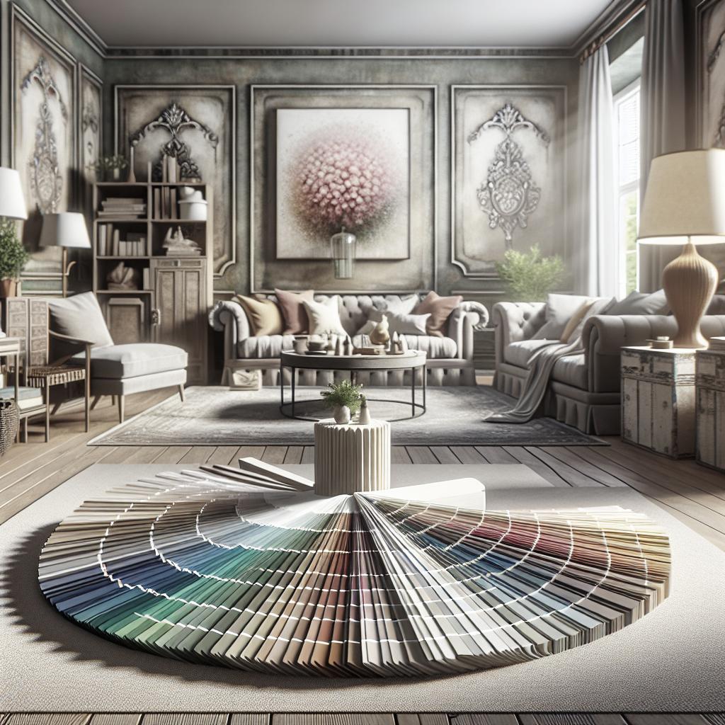
Introduction In the vibrant world of web design, bold colors are an indispensable tool for capturing users’ attention and creating memorable digital experiences. Mastering the use of these colors requires a keen eye for contrast, a deep understanding of color psychology, and the ability to create harmonious combinations. This blog post explores practical strategies for using bright and bold colors effectively, including understanding their psychological impacts, choosing complementary shades, experimenting with textures and gradients, and leveraging background images. By the end, you’ll have a comprehensive understanding of how to incorporate bold colors into your web design to make it aesthetically pleasing, accessible, and engaging. — How to use bright and bold colors effectively in web design Bright and bold colors can transform a website from mundane to vibrant, leaving a lasting impression on visitors. To harness their power effectively, it’s essential to align them with the brand’s identity and message. For instance, a tech startup aiming to portray innovation might lean towards bold blues and greens to evoke trust and futurism. The careful application of these colors can significantly influence the mood and behavior of users, guiding them subtly through a website’s content and calls to action. Incorporating bold colors requires a fine balance; overdoing it can lead to a chaotic user experience. By using bold colors as accents or highlights—such as in buttons, headers, or call-to-action elements—you can draw attention to key areas without overwhelming the senses. Consider the overall design elements, ensuring that bold colors work in harmony with more subdued tones for balance and clarity. — Contrasting colors for maximum impact Contrast is a fundamental principle in design that helps to create focus and clarity. Using contrasting bold colors strategically can highlight important elements, ensuring they stand out to the user. High contrast between the background and text elements, for example, can improve readability and user engagement. By thoughtfully applying contrasting colors, designers can guide the user’s journey through the site more intentionally. Color contrast for accessibility Accessibility is a crucial aspect of modern web design, and color contrast plays a pivotal role in making websites usable for everyone, including those with visual impairments. Web Content Accessibility Guidelines (WCAG) suggest specific contrast ratios to ensure text is legible. For example, a high contrast ratio between text and its background can assist users with low vision. Tools like contrast checkers are available to help designers assess and optimize the accessibility of their color schemes. — Understand the psychological effects of color Colors are powerful communication tools that can influence perceptions and emotions. Understanding the psychological effects of different colors allows designers to strategically evoke desired responses. For instance, red is often associated with urgency and can stimulate appetite, making it a popular choice for food delivery services and restaurants. Blue, on the other hand, is calming and denotes trust, often used by healthcare and technology companies. Considering your audience is crucial when selecting colors. Cultural differences can alter color interpretations; for example, while white represents purity in Western cultures, it symbolizes mourning in some Asian cultures. Tailoring color use to suit your target demographic can enhance relatability and influence user behavior positively. — Choosing the right color combinations Selecting the appropriate color combinations is an art that requires understanding color harmonies and the color wheel. Complementary combinations, which are opposite each other on the color wheel, can provide vibrant contrast and bring balance when used judiciously. For example, a combination of royal blue and bright orange can create an energetic and appealing aesthetic. Analogous color schemes, which use colors next to each other on the color wheel, offer a more subdued and harmonious feel. This approach might include shades of purple, blue, and teal for a cohesive and pleasing look. Using online tools, such as color scheme generators, can simplify the process of choosing harmonious color palettes that align with your brand’s personality and objectives. — Play with textures and gradients Textures and gradients add depth and dimension to web design, complementing the use of bold colors. Gradients, in particular, have made a strong comeback in recent years, offering versatility and a modern edge. A smooth transition between colors, such as from orange to pink or teal to blue, can enhance visual appeal and create a dynamic background without being distracting. Textures, whether subtle or pronounced, can add a tangible quality to digital interfaces. By incorporating textures like grain, pattern overlays, or paper effects, designers can add warmth and engage users more deeply. This technique allows for creative expression and can make bold color palettes feel more sophisticated and intentional. — Smart use of background images to enhance your design Background images can either complement or overpower web design, depending on their usage. When paired with bold colors, images can add context and storytelling to a page. Opting for images that feature a monochromatic scheme or using overlays can help maintain focus on the main color elements and text, ensuring the site remains readable and user-friendly. Using lighter filters or opacity adjustments can subtly blend images into the design, allowing bold colors to remain the focal point. This approach keeps websites visually appealing but not overwhelming, facilitating a balanced layout that supports overall communication goals. Experimenting with different image treatments can uncover innovative ways to enhance design impacts while retaining functionality. — Final Thoughts Effectively wielding bold colors in web design requires thoughtful strategy and consideration for both aesthetic appeal and functionality. Leveraging contrasting colors, understanding the psychological impact, crafting harmonious combinations, and experimenting with gradients and textures can significantly enhance user experience. By integrating these elements with a touch of creativity, you can create engaging and user-friendly designs that resonate well with your audience. “`html
| Aspect | Key Considerations |
|---|---|
| Using Bright Colors | Align with brand identity, balance with subdued tones. |
| Contrasting Colors | Create focus, enhance readability, improve accessibility. |
| Color Psychology | Influence emotions and behavior, consider cultural differences. |
| Color Combinations | Use complementary and analogous schemes for balance. |
| Textures & Gradients | Add depth, create modern designs with dimension. |
| Background Images | Complement design, enhance storytelling with subtle treatment. |
“` You might also like – “Understanding the Basics of Color Theory for Web Design” – “Enhancing UX with Thoughtful Use of White Space” – “Using Minimalist Design Principles to Maximize Clarity”